GRACE FAMILY OF CHURCHES REBRAND // About the Project
The Grace Family of Churches is a group of ten churches across the southeastern United States that share vision, values, doctrines and resources.
The vision of the Grace Family of Churches was clear to the central team, but was unclear and confusing to those on the outside and at the local Grace churches themselves. So, a rebrand was necessary for clarity not only in brand aesthetic, but in brand voice, communication and vision.
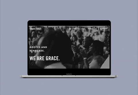
The rebrand began with a clarity exercise and a simplification of language and defining clear, nameable values. The website was re-designed from a single long page format of novella-like information to more digestible bites of information and clear actions, making the site more approachable for the viewer to learn about the movement. (See gfc.tv to view website)
The original brand mark was designed by Matchstic for Grace Midtown in 2010 and was shortly thereafter adopted by most of the local Grace churches. The bold Trade Gothic font with the box around the church name became the common mark and so it made sense to adopt this same format for the Grace Family when it came time to rebrand.
The Grace Family focuses on training and development of future leaders as well as fundraising. Therefore the aesthetic had to be tangible and relatable, yet mature in nature to give credibility and trust for larger donors. The mid-tones of blues and deeper warm tones alongside the familiarity of Trade Gothic creates the foundation of the brand. IvyPresto Display was introduced during the rebrand as a confident, mature and clean influence–and when paired with the modernity and youthfulness of Trade and Futura, it created the perfect visual aesthetic for the main tag line of the Family–”Rooted and Renegade.”
Creative Direction, Branding, Web & Graphic Design: Abany Bauer